The Great Escapes: Top 10 Pantone Colors
The Great Escapes: Top 10 Pantone ColorsPosted Tuesday September 7, 2010
From WWD Issue 09/07/2010
Escapism, a theme that first cropped up in Pantone’s most popular color schemes last year, is still going strong for spring. To try to help consumers forget their cares, designers tapped into hues often seen in Africa, India, Peru and Turkey. Honeysuckle topped the charts for the season’s leading color for women, followed by Regatta, Coral Rose and Beeswax. Leatrice Eiseman, executive director of the Pantone Color Institute, said, “This time, everything is a little more exotic. It really has to do with everything that is happening in the world. There is still a lot of concern about the economy and life in general. It is very natural that designers would have those things in their thought process as they choose their colors.”
Tag Archives: Color
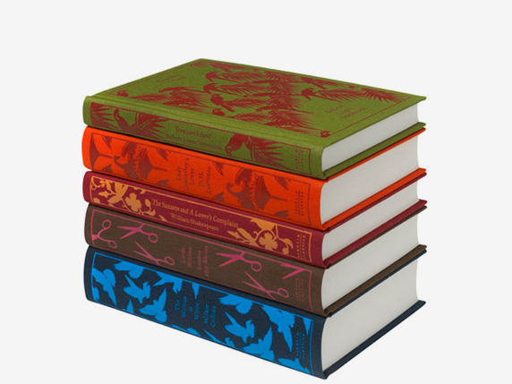
Coralie Bickford-Smith: The Power of a Limited Palette :: Articles :: The 99 Percent
I enjoyed this article on design process. She talks about the importance of color and some of the constraints that actually help her make choices.
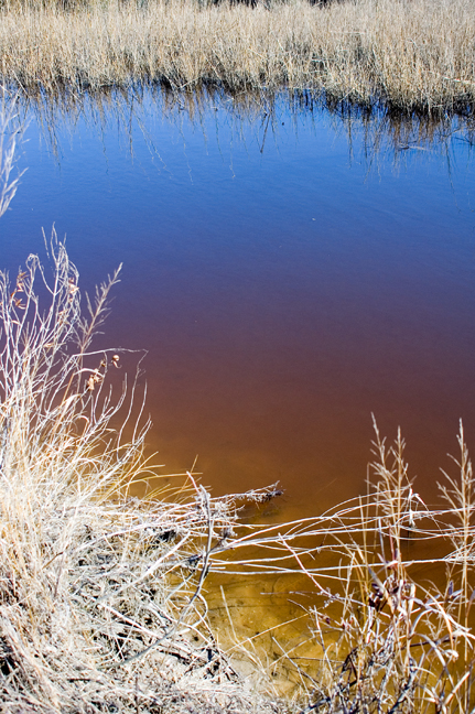
Marsh Water Colors Observation
Nasty morning here but it cleared to spectacular blue skies with perfectly
puffy clouds. Took a break and meandered down to the marsh. Too much glare
this time of day but I was happy to get this shot. I’d observed the amazing
gradation of color on another recent walk but didn’t have my camera that
time. Excuse the blown out grasses in the foreground but I wanted to record
the way the fresh water runoff brings the amber-brown tannins down to the
salt marsh. The downward view shows the true color. The middle range
passes through a oxblood red. Then the sky reflections gradually take over
as the glassy surface recedes. Imagine trying to paint this!


