Color in Film – Avatar

****  I suggest reading my Color in Film reviews AFTER your first viewing of the film.  I try to avoid major spoilers but some giveaways are impossible to prevent.  Also, I think you will better enjoy the element of surprise and knowing that your own emotional response to the film is fresh and untainted if you see the film first.

 _______________

Alien Beauty:

By now everyone knows this movie’s plot is nothing special.  I had hesitated to bother even seeing it but word-of-mouth enthusiasm won me over.  How many possible plots are there anyway?  It turned out to have plenty of emotional content to keep me fully involved.

I chose to see it in 2D as I was afraid 3D might give me vertigo or make me nauseous.  Now I am thinking of sneaking off for a second viewing on my own in order to see it in 3D.  That way, if I have to leave I won’t spoil anyone else’s day.

So, to the film:

Absolutely breathtaking visuals.  And color plays a major part in the effect.  Of course the bad guys (humans) are in military earth tones.  But Pandora!  The running theme of violets establishes the otherness of this world.  Clear aquas, blues and spring greens trumpet health and vitality.  Careful use of pristine white blazes through with purity.

Enter vibrant red-orange, black and yellow and you KNOW something fierce is present.  But this turok has a crest and beard of royal blue – balancing the obvious threat with nobility and intelligence.

There were times I’m sure my mouth hung open and I was nearly teary-eyed just trying to absorb the beauty of this film.

Talking later, a nephew said it reminded him of the Garden of Eden.  I had thought of Lewis’s “real Narnia” in The Last Battle where all colors are heightened and pure.  This brings in the possible connection to Plato’s ideal types but I prefer to leave it all for the wonder of a fantasy story.

If you haven’t seen it yet – what are you waiting for???  I’ll probably go again!

There are probably hundreds of examples, but do you have any favorite color moments from Avatar that you would like to share?


Sherlock Holmes – Review


A friend and I enjoyed the new Sherlock Holmes film last night so I thought I’d write up a quick review.

In typical Guy Ritchie style this film comes at you with lightening speed – in some places it’s too fast to follow.  But I’ve never seen a Guy Ritchie film that I didn’t want (and need!) to see twice, so I’ll probably return to this one with my husband this weekend.

I am a complete sucker for period production, especially late 19th century London.  Even though much of the visual context is clearly computer generated, I’ll be watching the film again just to enjoy the Dore-like detailed gloom.

The visual elements are under total control.  Sepia and navy blue dominate with accents of warm browns and deep burgundies.  The most overt color moment is our introduction to Irene Adler.  Before we see her we get glimpses of her dress and our brains are immediately cued for “Oh, here comes the girl, the love interest”.  As the color registers further the brain says, “Ah, seductress!”  Only then do we get the full image of Rachel McAdams in a gown of – what color is this really?  Its saturation in the context of all we’ve seen thus far is almost overwhelming.  And yet it’s not quite what you would expect.  It’s not red.  It’s not hot pink.  It has very strong blue tones – an intense mauve – if there is such a thing.  This unexpected color does two things – it ties in with the rest of the film’s visuals by picking up the blues while signaling the emotional and symbolic content of “a women in red”.  But it is also ambiguous.  This shift towards the blue-purple makes you hesitate to categorize Irene just as you struggle to categorize the color.  Brilliant.

Following this scene Irene’s costumes join the rest of the production’s neutrals and navy blues – with just the occasional touch of deep red to remind us of her role.   I’ll say no more on that lest I say too much.

Another subtle color theme is a recurring Persian/royal blue.  Again the context of neutrals shows off the nearly magical quality of this color that occasionally appears in symbolic mosaic tile, upholstery and carpet.  It is a needed relief from the otherwise consistent grays, browns, mahoganies and navies.  It hints at authority with a touch of the mystical.

Overall I’ll give this film a 4 out of 5 stars.  Robert Downey Junior and Jude Law play well together.  Mark Strong has a perfectly villainous voice and Rachel McAdams looks great in dark, smoky eyeshadow. Occasionally RDJ’s cotton-wooled British accent is mumbled so quickly the words never register.  But I suggest you just relax and enjoy the action and the fun.  The details will all come clear in the end – in true Guy Ritchie/Sherlock Holmes fashion.


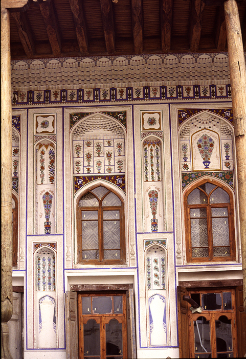
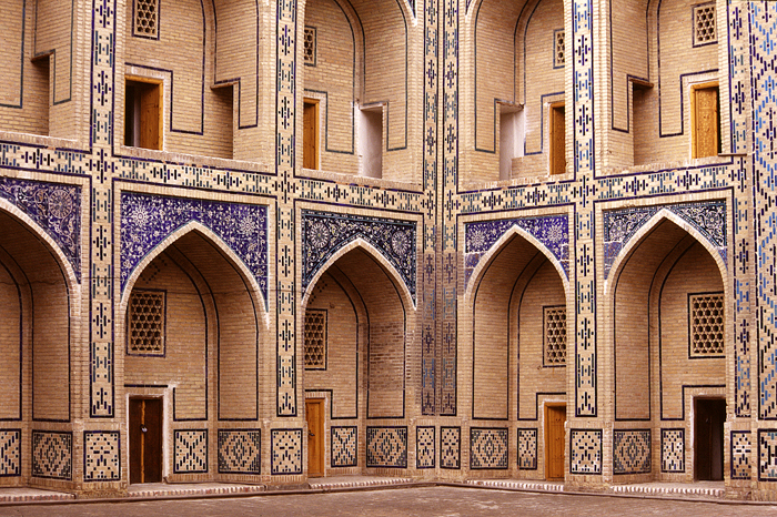
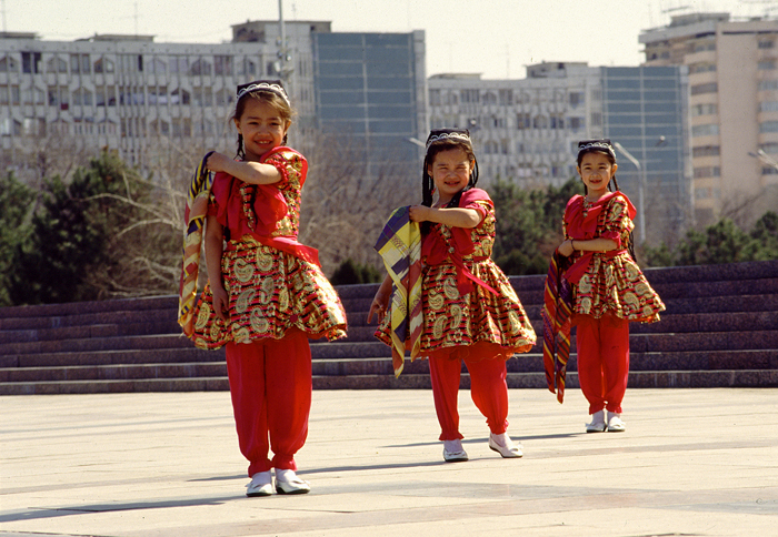
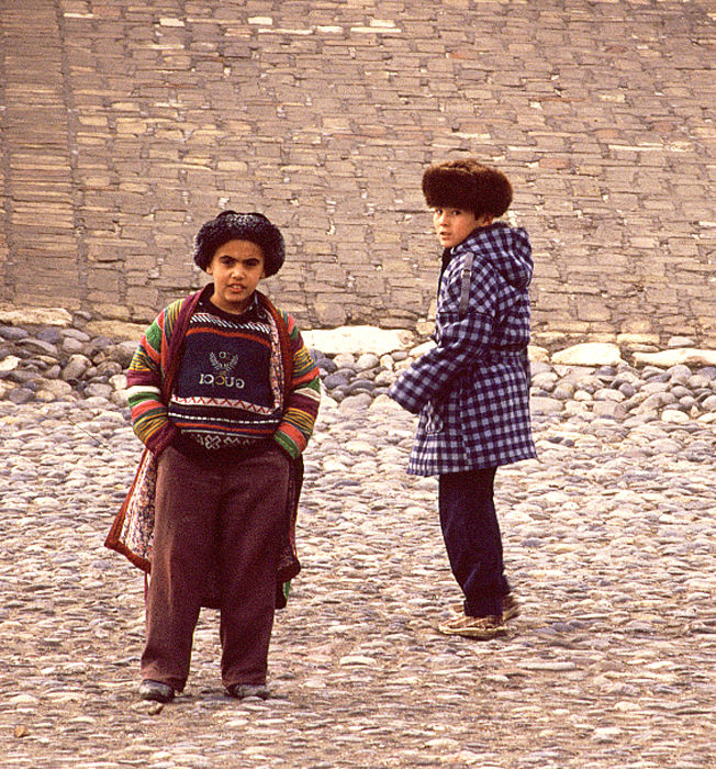
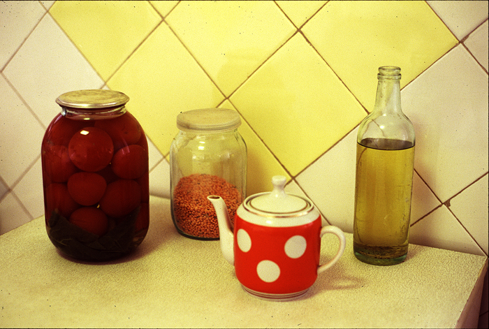
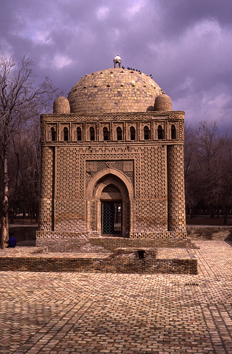
Some Photos From 1995 Trip to Uzbekistan

These images are scans of old slides taken during a 6 week trip to
Uzbekistan in 1995. I have stacks more sitting with all my other old slides
waiting to be cleaned, sorted and scanned. Maybe I’ll finally get to that
project this winter?

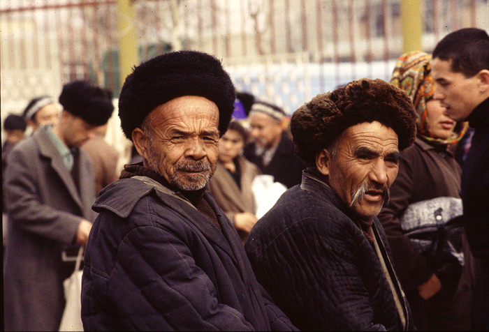
The image of the two older fellows was taken in the market in Osh, Kyrgystan
on a day trip from Andijan in the Fergana Valley. That market was one of
the two places on this planet where I most felt like I’d stepped back in
time. Even there, if I looked up to the surrounding hills I could see
Soviet style apartment blocks.

My other time warp experience was in Fez’s traditional Market the following
year. I’ll post some of those shots eventually too.

Bukhara_door_panelBukhara_house_museumBukhara_madrassaDancing_girls_rehearsalLads_at_entrance_to_buhkara_foSoviet_still_lifeTwo_men_in_osh_marketZoroastrian_temple_near_bukhar

A Religious Journey, Illustrated – The New York Times

Media_httpgraphics8nytimescomimages20091217arts32040397jpg_oifkprnnejdjnwn

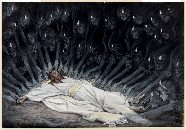
This morning’s NYTimes has an article and slide show about the current exhibition of Tissot’s extensive works on the life of Christ at the Brooklyn Museum. As a lover of gouache – opaque watercolor – I wish I could get up close to these gems. Besides the story-telling power of 350 near-miniature, highly researched images I am struck by Tissot’s beautiful control over a strict palette. Primarily white, blue-grays, ochres and siennas with touches of greens, Tissot has unified the imagery without any sacrifice of emotional power or visual interest.

The Brooklyn Museum’s web site has additional images from the show on display – www.brooklynmuseum.org/exhibitions/james_tissot/ – as well as the show’s catalog which includes ALL 350 for the images from the series.

If anyone is wondering what to get me for Christmas, here’s a very big hint.

http://shop.brooklynmuseum.org/jatica.html

“If it’s Purple, Someone’s Gonna Die” by Patti Bellantoni

These days I am primarily a painter, but my true passion is scenery and
lighting design for the stage. Theatre design books usually have a chapter
on basic color theory and how colored light contributes to location, time of
day, atmosphere and mood in a production. There is rarely any discussion of
the deliberate use of color in scenery. As a set designer I have had to
resort to what I’ve learned about color generally and apply that
understanding to the performing arts.

So, I was thrilled when trawling Amazon.com for books on color and up popped
this title: “If it’s Purple, Someone’s Gonna Die”! Whoa! With a title like
that and the subtitle: “The Power of Color in Visual Storytelling,” I had to
investigate!

“If it’s Purple, Someone’s Gonna Die” by Patti Bellantoni is a unique look
at the use of color in cinematography. Ms. Bellantoni teaches Color and
Visual Storytelling as a faculty member of the Conservatory of American Film
Institute in Los Angeles. She has also taught or consulted in the field of
film design and production for several other institutions. Over the years
she has taken her students through various color response experiments,
testing their emotional reactions to colored environments and their own
associations of colors with sounds, smells and ideas. These experiments
have consistently resulted in the same universal conclusions about emotional
and psychological cues as those of the International Association of Color
Consultants (www.iaccna.org).

In her book, Ms. Bellantoni lifts key scenes from dozens of well-known films
to show how color contributes to propelling the story through mood and
subconscious audience response. From the overt use of a yellow and black
taxi cab (bumble-bee, danger) to stalk prey in “Taxi”, to more subtle uses
of golden light in the two very different films “Much Ado About Nothing” and
“The Talented Mr. Ripley”, Ms. Bellantoni shows how yellow can be either
romantic or threatening depending on its application. She shows how green,
depending on its shade and context can convey poison (Snow White and the
Seven Dwarves), healthy vitality (The Witness), or corruption and
suffocation (The Virgin Suicides). She gives dozens of fascinating
examples.
Ms. Bellantoni includes interviews with production designers and
cinematographers about how they came to certain key color choices. Both she
and they acknowledge that not all the color in their films was deliberately
planned. Certainly some choices were made based on intuition and spur of
the moment opportunity. Ms. Bellantoni recognizes the interaction between
analysis and innate visceral response, giving us many examples of how color
can and has been used in film – whether deliberately or not. She
acknowledges that most of our color response is built in.

She says,
“Interestingly enough you already possess the information you need in
choosing a color. It is simply stored in your own perceptual depository.
Only recently, a young designer, unknown to me, asked me what a particular
color meant. I asked her to close her eyes and remember a time when she
felt afraid and tell me what colors her feelings were. The colors she chose
were exactly the colors that my students have chosen over and over again in
our color experiments.”

As film directors and production designers increasingly understand the
impact of color on storytelling they are becoming more deliberate in their
choices and planning. The value of studying the emotional response to color,
whether for story telling or the built environment, is learning to recognize
universal responses and harnessing those for more intentional control over
that response.

The book lives up to its startling title. It is a fun as well as
informative read, whether you are involved in any kind of “story telling” or
just a movie fan. It makes me want to dig out these and other favorite films
and scan through them without audio to see if I can identify other moments
of significant color use in the story telling process. As a theatrical
designer I’m thrilled to have a book that finally discusses the application
of color in the performing arts.

After the Storm

After four days of gray-upon-gray my eyes were craving color! Shortly after
the last of the high tides I grabbed my camera and walked down to the
marshes. The colors were startling. After so many wide, landscape shots I
am starting to look closer to find the hidden surprises. Unfortunately my
zoom doesn’t have macro capabilities but I can still find beautiful images
at mid-distances.

2009-11-15_bb_am_109a

2009-11-15_bb_am_173a

2009-11-15_bb_am_186a

2009-11-10_onemo_trees043a