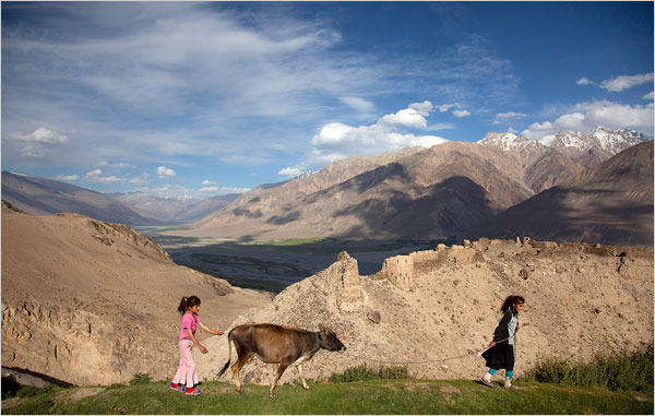
Nice slide show and accompanying article from the New York Times on Tajikistan that I meant to link to last week. Next post – some of my own photos from Uz.
Category Archives: Uncategorized
Historic paint analysis changes the colors of Colonial Williamsburg –
Here’s an interesting article from the Daily Press about new color treatments for the buildings of Colonial Williamsburg based on a recent, more accurate understanding of the original colors.
A Religious Journey, Illustrated – The New York Times
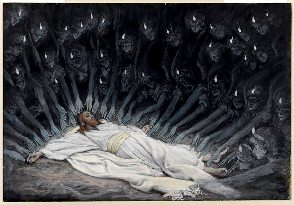
This morning’s NYTimes has an article and slide show about the current exhibition of Tissot’s extensive works on the life of Christ at the Brooklyn Museum. As a lover of gouache – opaque watercolor – I wish I could get up close to these gems. Besides the story-telling power of 350 near-miniature, highly researched images I am struck by Tissot’s beautiful control over a strict palette. Primarily white, blue-grays, ochres and siennas with touches of greens, Tissot has unified the imagery without any sacrifice of emotional power or visual interest.
The Brooklyn Museum’s web site has additional images from the show on display – www.brooklynmuseum.org/exhibitions/james_tissot/ – as well as the show’s catalog which includes ALL 350 for the images from the series.
If anyone is wondering what to get me for Christmas, here’s a very big hint.
Marina Draghici, ‘Fela!’ Costume Designer, Shops for Inspiration
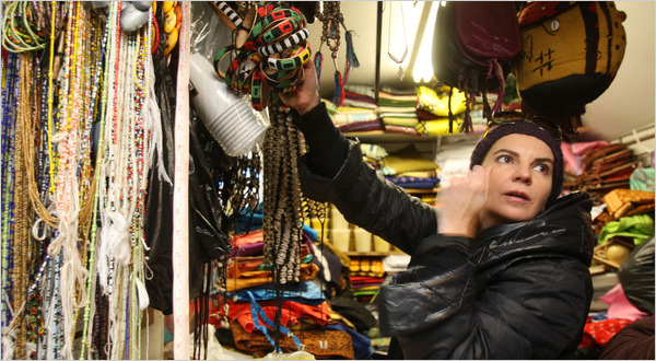
Thanks to the good eye of my friend Kim Senior http://kimsenior.blogspot.com/ for catching this NYTimes www.nytimes.com article about the costume designer for the Broadway show Fela and the movie Precious.
“If it’s Purple, Someone’s Gonna Die” by Patti Bellantoni
These days I am primarily a painter, but my true passion is scenery and
lighting design for the stage. Theatre design books usually have a chapter
on basic color theory and how colored light contributes to location, time of
day, atmosphere and mood in a production. There is rarely any discussion of
the deliberate use of color in scenery. As a set designer I have had to
resort to what I’ve learned about color generally and apply that
understanding to the performing arts.
this title: “If it’s Purple, Someone’s Gonna Die”! Whoa! With a title like
that and the subtitle: “The Power of Color in Visual Storytelling,” I had to
investigate! “If it’s Purple, Someone’s Gonna Die” by Patti Bellantoni is a unique look
at the use of color in cinematography. Ms. Bellantoni teaches Color and
Visual Storytelling as a faculty member of the Conservatory of American Film
Institute in Los Angeles. She has also taught or consulted in the field of
film design and production for several other institutions. Over the years
she has taken her students through various color response experiments,
testing their emotional reactions to colored environments and their own
associations of colors with sounds, smells and ideas. These experiments
have consistently resulted in the same universal conclusions about emotional
and psychological cues as those of the International Association of Color
Consultants (www.iaccna.org). In her book, Ms. Bellantoni lifts key scenes from dozens of well-known films
to show how color contributes to propelling the story through mood and
subconscious audience response. From the overt use of a yellow and black
taxi cab (bumble-bee, danger) to stalk prey in “Taxi”, to more subtle uses
of golden light in the two very different films “Much Ado About Nothing” and
“The Talented Mr. Ripley”, Ms. Bellantoni shows how yellow can be either
romantic or threatening depending on its application. She shows how green,
depending on its shade and context can convey poison (Snow White and the
Seven Dwarves), healthy vitality (The Witness), or corruption and
suffocation (The Virgin Suicides). She gives dozens of fascinating
examples.
Ms. Bellantoni includes interviews with production designers and
cinematographers about how they came to certain key color choices. Both she
and they acknowledge that not all the color in their films was deliberately
planned. Certainly some choices were made based on intuition and spur of
the moment opportunity. Ms. Bellantoni recognizes the interaction between
analysis and innate visceral response, giving us many examples of how color
can and has been used in film whether deliberately or not. She
acknowledges that most of our color response is built in. She says,
“Interestingly enough you already possess the information you need in
choosing a color. It is simply stored in your own perceptual depository.
Only recently, a young designer, unknown to me, asked me what a particular
color meant. I asked her to close her eyes and remember a time when she
felt afraid and tell me what colors her feelings were. The colors she chose
were exactly the colors that my students have chosen over and over again in
our color experiments.” As film directors and production designers increasingly understand the
impact of color on storytelling they are becoming more deliberate in their
choices and planning. The value of studying the emotional response to color,
whether for story telling or the built environment, is learning to recognize
universal responses and harnessing those for more intentional control over
that response. The book lives up to its startling title. It is a fun as well as
informative read, whether you are involved in any kind of “story telling” or
just a movie fan. It makes me want to dig out these and other favorite films
and scan through them without audio to see if I can identify other moments
of significant color use in the story telling process. As a theatrical
designer I’m thrilled to have a book that finally discusses the application
of color in the performing arts.
After the Storm
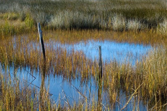
After four days of gray-upon-gray my eyes were craving color! Shortly after
the last of the high tides I grabbed my camera and walked down to the
marshes. The colors were startling. After so many wide, landscape shots I
am starting to look closer to find the hidden surprises. Unfortunately my
zoom doesn’t have macro capabilities but I can still find beautiful images
at mid-distances.
Weathering the Storm
Three high tides down and two to go.
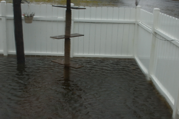
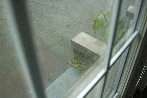
Last night’s high was by far the worst – about a foot above the first highof the storm on Thursday morning – right up to the bottom shelf on the cat
climbing pole pictured below. This morning was high again but not as high
as last night. Tonight and tomorrow morning’s highs are not expected to be
nearly as bad. I have the heat pump off until the HVAC guy and the flood
adjuster can have a look at things on Monday. I kept all of the power off
during the highest tides but have turned it back on this afternoon. So,
I’ll just have a space heater for a few days but at least I’ll get a hot
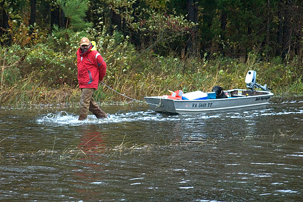
shower! The fellow in the boat is a neighbor who was taking advantage of this
afternoon’s LOW tide to go check on his house closer to the beach.
Thankfully he lifted that lovely old house about 9′ off the ground several
years ago so I’m sure he’ll find it high and dry. Today he parked in my
drive and put in at the side of my house. Note that he walks in the water
while his dog gets to ride! Now, enough of all this gray! We need some blue skies ASAP! I’m hoping to
be back in the studio in a few days!
Flood Interlude
Silly me for thinking I had a clear slate of several days for working on a
painting commission and various studio projects.
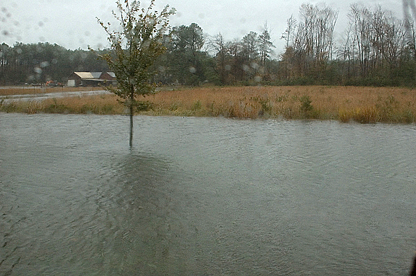
this before. The pictures show this morning’s high tide. It has since
dropped about 4 inches and that may be all we get of low tide today. By this evening I will need to turn off the heat pump and probably the power
– if the power is even still on locally. There is wiring under my
house and so… best to shut it down. Kitties and I will just pile on the
blankets and wait for the final pass of tides Friday morning. By then I’m
sure I will be without air ducts and in search of repairs. This is the price of living so close to my beloved marshes. In the meantime, I have a long neglected stack of magazines and as long as
the power is on – hot teas 🙂 Keep your head above water!
Plein Air Day
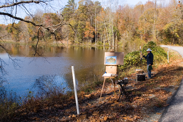
Our local plein air group met for the last time of the season today – or I
should say two of us turned out for it. It was chilly but sunny. As you can
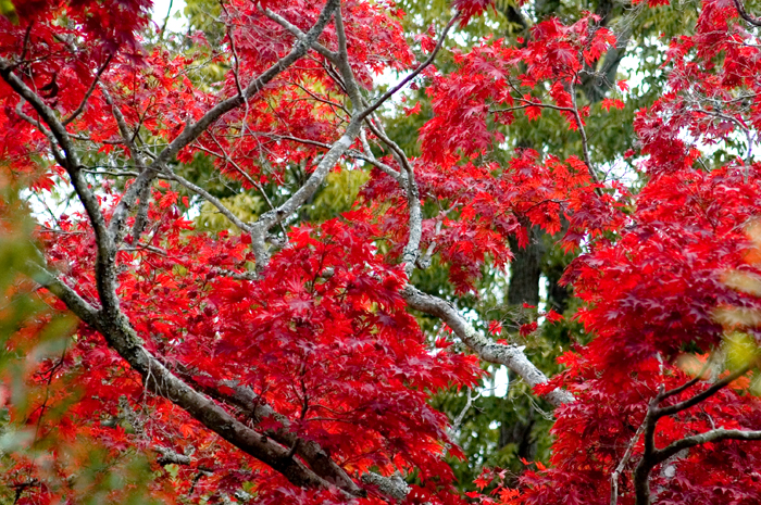
see, the colors peaked about a week ago.
paint – certainly not with intent to actually finish, or even start a studio
painting. I’d always thought it would be the elements that would put me off
but it turns out to be more about approach and materials. Plus, coming at
this from years of painting stage scenery and murals, I realize that I
really do like to paint large. 24×36 inches feels small to me and that’s
just not an option for the old plein air/alla prima method. I will, in
future, join in these sessions because the camaraderie is great and there is
so much benefit in drawing and painting from life. But I will treat them
like sketchbook sessions rather than attempt to radically change my style in
order to partake in the current plein air craze. Know thyself. Right?
Fall Color
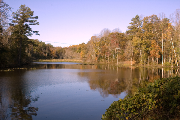
I had to take advantage of this beautiful day and walk to the channel with
my camera in tow. I am never disappointed.

