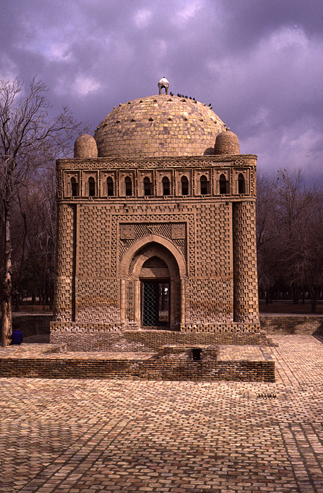
Bethel Beach in Snow

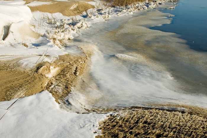
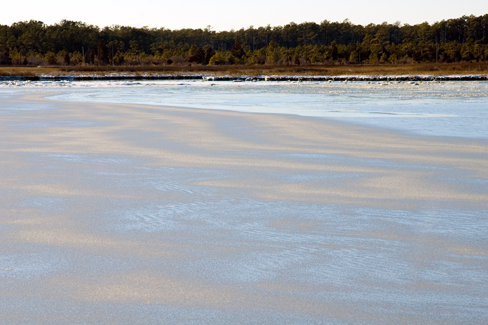
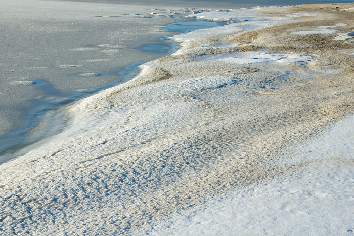
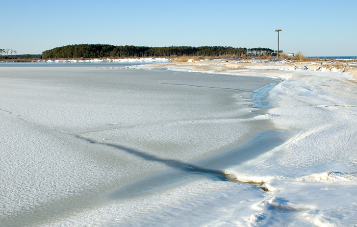
After a night and a day of snow and steady winds today was glorious. By
this afternoon I’d mustered the courage to bundle up and head for Bethel
Beach Nature Preserve. It was only in the 20s but there was little wind so,
although I was out there for nearly 2 hours, I was perfectly comfortable in
all my layers.

Walking was tricky. It was impossible to tell where solid ground ended and
snow-covered marsh began. Even stepping cautiously I still ended up knee
deep in marsh grass voids several times. I didn’t end up in any water
though. Whew!

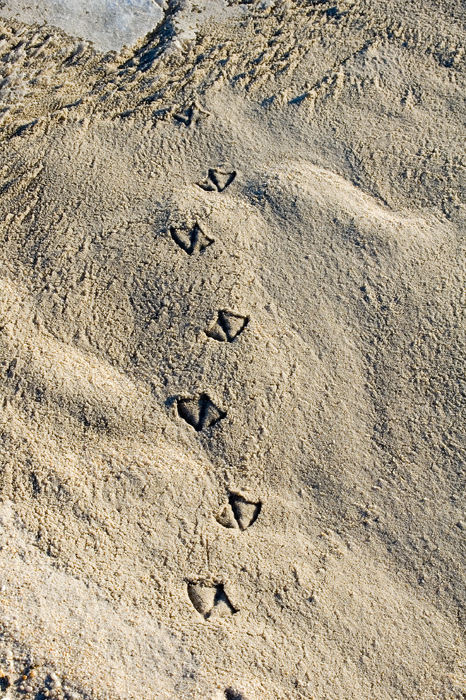
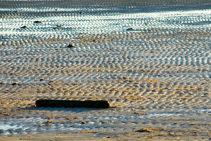
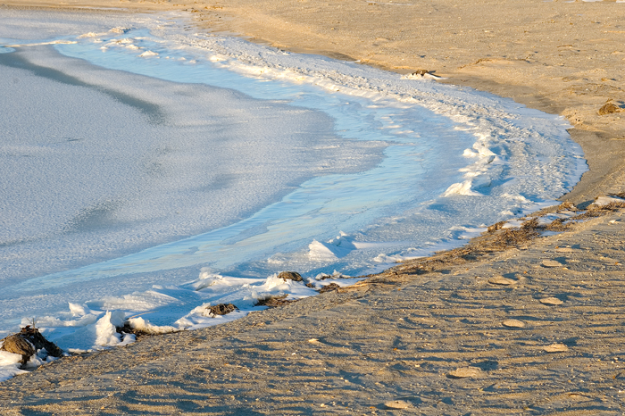
Here’s a selection of the 250 plus images I shot. This is my first real
attempt at shooting snow. I worked from an aperture priority and kept an
eye on my histograms – adjusting exposures accordingly. It’s very hard not
to blow out the highlights but I learned a lot.

2010-02-01_bb_pm_snow_024a2010-02-01_bb_pm_snow_072a2010-02-01_bb_pm_snow_125a2010-02-01_bb_pm_snow_149a2010-02-01_bb_pm_snow_161a2010-02-01_bb_pm_snow_164a2010-02-01_bb_pm_snow_173a2010-02-01_bb_pm_snow_177a2010-02-01_bb_pm_snow_201a2010-02-01_bb_pm_snow_207a2010-02-01_bb_pm_snow_214a2010-02-01_bb_pm_snow_219a2010-02-01_bb_pm_snow_241a2010-02-01_bb_pm_snow_250a2010-02-01_bb_pm_snow_254a2010-02-01_bb_pm_snow_260a2010-02-01_bb_pm_snow_281a

Marsh Water Colors Observation

Dsc_0844_small

Nasty morning here but it cleared to spectacular blue skies with perfectly
puffy clouds. Took a break and meandered down to the marsh. Too much glare
this time of day but I was happy to get this shot. I’d observed the amazing
gradation of color on another recent walk but didn’t have my camera that
time. Excuse the blown out grasses in the foreground but I wanted to record
the way the fresh water runoff brings the amber-brown tannins down to the
salt marsh. The downward view shows the true color. The middle range
passes through a oxblood red. Then the sky reflections gradually take over
as the glassy surface recedes. Imagine trying to paint this!

NYTimes – Art Review – ‘The Drawings of Bronzino’ – At the Met, Florentine Master’s Spirited Drawings

I’ve gotten ridiculously busy and so neglecting my blog but I wanted to embed this article here in case folks miss it. Wish I could dash up to the city and have a look for myself but I’m deep into preparations for several interesting decorative painting/mural projects, preparing to teach Acrylic Fundamentals in February and studying for my final oral exam for the International Association of Color Consultants in March. So, I’ll be catching up with the blog in a few days.

_____________________________________________________________________

Here’s the Article

Agnolo Bronzino’s was the hand to hire for a power portrait in mid-16th-century Florence. He could turn toddlers into potentates and make new-money Medicis look like decent people. His painting shaped late Mannerism, the profane, twisty, prosthetic style that erupted, like a repressed libido, between the humanist sanctities of the Renaissance and the smells and bells of the Counter-Reformation.

Enlarge This Image

Louvre Museum

The Drawings of Bronzino “Seated Nude Youth Playing Panpipes,” in the show at the Metropolitan Museum of Art. More Photos »

Multimedia


Acrylic Foundations – at the Bay School in Mathews!

I’m happy to announce that I am scheduled to teach the following class at
the Bay School in Mathews, Va.

Here’s the Blurb:

Acrylic Foundations

This is a structured class for total beginners or more experienced painters
who may have missed foundational skills training. We will learn to see the
importance of values for expressing form, mood and space, explore the
possibilities of color mixing and color use in visual art and finish with
your own still-life painting. Acrylic paint is highly versatile and
forgiving making it a great place to start. The skills introduced in this
workshop are applicable to any visual medium. In past workshops students
have made huge leaps in their skills and understanding during this 12-hour
intensive. Come and launch your new love for painting or fill in the gaps in
your basic understanding of imagery.

4 Thursday Evenings – Feb. 11th – March 4th

6pm – 9pm

Cost: $65 Class fee/$20 Materials Fee

ALL Materials are provided (but if you have your own stuff you’d like to
bring along, that’s fine too!)

BIO:

Lausanne Davis Carpenter earned her BFA in scenery and lighting design for
the stage from SUNY Purchase. She worked as a designer and scenic artist in
NYC and regional theatres then took a 12 year hiatus from the arts while
living mostly overseas. In 2002 she returned to the US and opened Marsh
Hawk Studio – a murals and decorative painting business. In 2004 she also
returned to designing scenery and lighting for the stage. She is nearing
completion of the requirements for fully-fledged membership in the
International Association of Color Consultants and is increasingly focusing
on fine art painting.

Bay School Location:

279 Main Street
Mathews, VA 23109
Past the Library; look for the blue awning)

CALL: 804-725-1278

Sign up Soon!

Recipe: Ground Turkey & Lima Bean Chili

I meant to make the usual red beans & ground turkey chili today. I went to
the cupboard last night and discovered I didn’t have kidney beans. I did
have a bag of limas. So, I tossed them in some water to soak over night.

This morning dug out the crock-pot then went to the pantry for a big onion.
Nada. Oh well. I was definitely not venturing in to town in this weather
just for an onion – especially when I had a good supply of garlic on hand.

So I just threw the following together. And, I gotta say – it’s pretty
good!

Ground Turkey & Lima Bean Chili

1 Bag Dry Baby Lima Beans – soak over night.

Garlic – lots
1 Tray of ground turkey
Cayenne – whole peppers from the freezer – as much as you think you can
stand.

Rinse soaked beans and put in crock pot with:

2 cans chicken broth

Sauté ground turkey until nearly dry. Toss in the garlic and cayenne.
Brown.

Toss turkey, garlic and peppers into crock-pot.

Simmer on High about 4 hours – *** Test lima beans to be sure they are soft.

Add:

One large can diced tomatoes.

Simmer. As long as you can maintain your self control.

Enjoy!

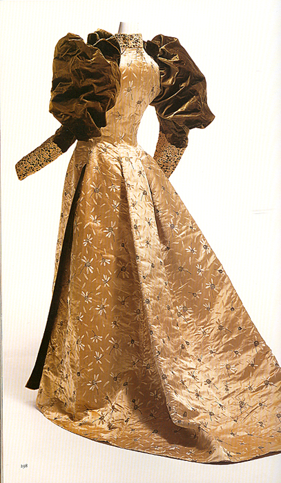
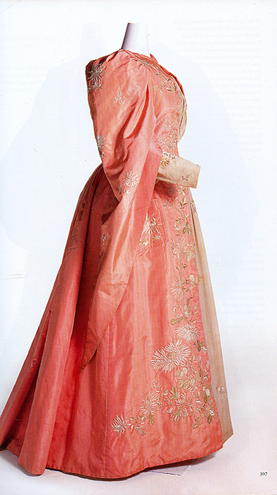
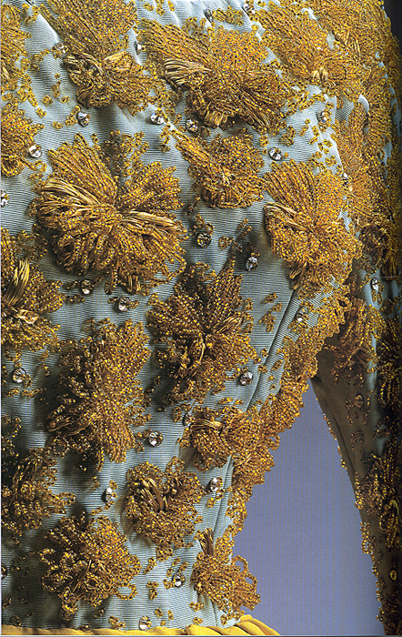
Book Review – FASHION: A History from the 18th to the 20th Century

The Collection of the Kyoto Costume Institute – TASCHEN.

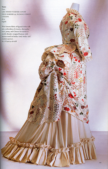
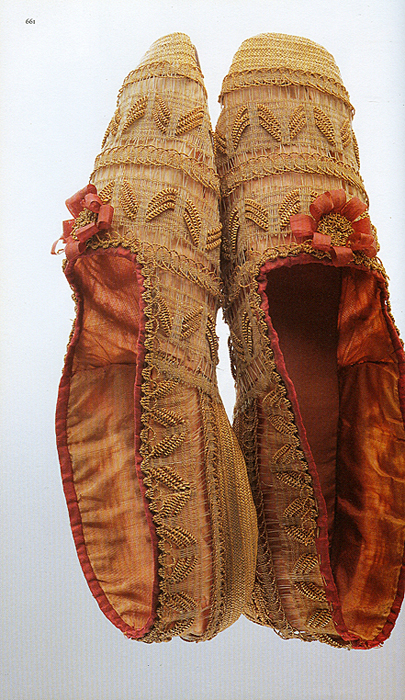
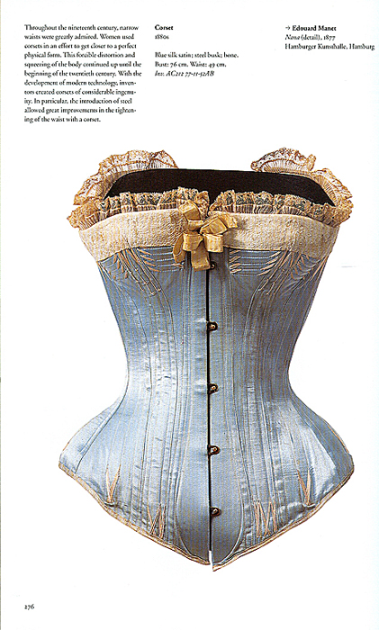
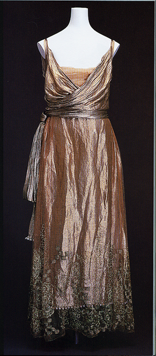
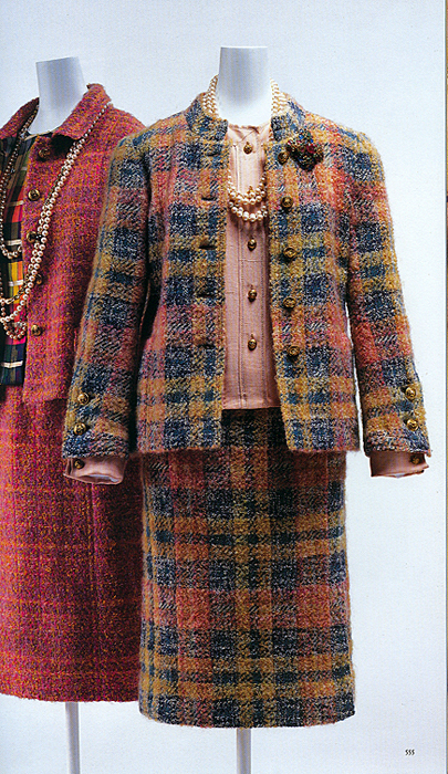
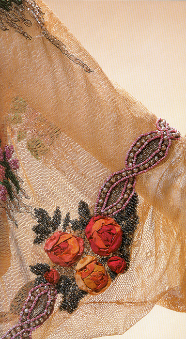
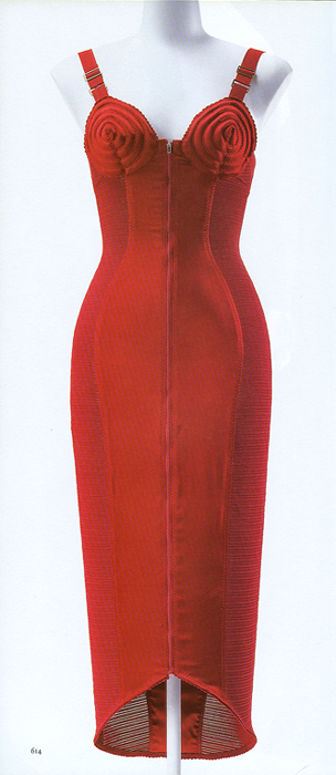
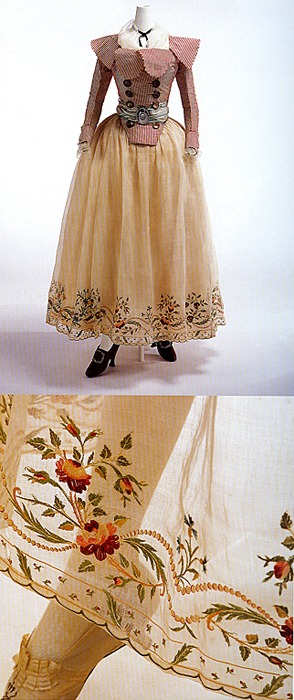
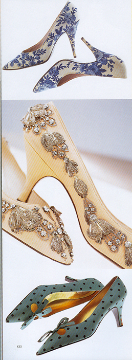
I am not a costume designer. I can operate a sewing machine but I have no idea how to put a simple dress together. Still, I couldn’t resist the eye candy in this book. I’m talking about seven! hundred! pages! of large images of spectacular clothing with close-ups of fabric, embroidery, lace, fringe, buttons, bows, hats and yes, even some shoes!
From the front flap:

The Kyoto Costume Institute recognizes the importance of understanding clothing sociologically, historically, and artistically. Founded in 1978, the KCI holds one of the world’s most extensive clothing collections and has curated many exhibitions worldwide. With an emphasis on Western women’s clothing, the KCI has amassed a wide range of historical garments, underwear, shoes, and fashion accessories dating from the 18th century to the present day. Showcasing a vast selection of skilled photographs from the Institute’s archives, … FASHION is a fascinating excursion through the last three centuries of clothing trends.

There is some informational text at the beginning of each century division and every image has a notation describing or explaining some aspect of the article shown.

I have scanned a few random images to give you just a hint of what is here.

The KCI’s current exhibit can be seen here. (Note the use of Playstation for
viewing. Now there’s a twist.)

Enjoy!

Scan0001Scan0002Scan0003Scan0004Scan0005Scan0006Scan0007Scan0008Scan0009Scan0010Scan0011Scan0012

Color in Film – Avatar

****  I suggest reading my Color in Film reviews AFTER your first viewing of the film.  I try to avoid major spoilers but some giveaways are impossible to prevent.  Also, I think you will better enjoy the element of surprise and knowing that your own emotional response to the film is fresh and untainted if you see the film first.

 _______________

Alien Beauty:

By now everyone knows this movie’s plot is nothing special.  I had hesitated to bother even seeing it but word-of-mouth enthusiasm won me over.  How many possible plots are there anyway?  It turned out to have plenty of emotional content to keep me fully involved.

I chose to see it in 2D as I was afraid 3D might give me vertigo or make me nauseous.  Now I am thinking of sneaking off for a second viewing on my own in order to see it in 3D.  That way, if I have to leave I won’t spoil anyone else’s day.

So, to the film:

Absolutely breathtaking visuals.  And color plays a major part in the effect.  Of course the bad guys (humans) are in military earth tones.  But Pandora!  The running theme of violets establishes the otherness of this world.  Clear aquas, blues and spring greens trumpet health and vitality.  Careful use of pristine white blazes through with purity.

Enter vibrant red-orange, black and yellow and you KNOW something fierce is present.  But this turok has a crest and beard of royal blue – balancing the obvious threat with nobility and intelligence.

There were times I’m sure my mouth hung open and I was nearly teary-eyed just trying to absorb the beauty of this film.

Talking later, a nephew said it reminded him of the Garden of Eden.  I had thought of Lewis’s “real Narnia” in The Last Battle where all colors are heightened and pure.  This brings in the possible connection to Plato’s ideal types but I prefer to leave it all for the wonder of a fantasy story.

If you haven’t seen it yet – what are you waiting for???  I’ll probably go again!

There are probably hundreds of examples, but do you have any favorite color moments from Avatar that you would like to share?


Sherlock Holmes – Review


A friend and I enjoyed the new Sherlock Holmes film last night so I thought I’d write up a quick review.

In typical Guy Ritchie style this film comes at you with lightening speed – in some places it’s too fast to follow.  But I’ve never seen a Guy Ritchie film that I didn’t want (and need!) to see twice, so I’ll probably return to this one with my husband this weekend.

I am a complete sucker for period production, especially late 19th century London.  Even though much of the visual context is clearly computer generated, I’ll be watching the film again just to enjoy the Dore-like detailed gloom.

The visual elements are under total control.  Sepia and navy blue dominate with accents of warm browns and deep burgundies.  The most overt color moment is our introduction to Irene Adler.  Before we see her we get glimpses of her dress and our brains are immediately cued for “Oh, here comes the girl, the love interest”.  As the color registers further the brain says, “Ah, seductress!”  Only then do we get the full image of Rachel McAdams in a gown of – what color is this really?  Its saturation in the context of all we’ve seen thus far is almost overwhelming.  And yet it’s not quite what you would expect.  It’s not red.  It’s not hot pink.  It has very strong blue tones – an intense mauve – if there is such a thing.  This unexpected color does two things – it ties in with the rest of the film’s visuals by picking up the blues while signaling the emotional and symbolic content of “a women in red”.  But it is also ambiguous.  This shift towards the blue-purple makes you hesitate to categorize Irene just as you struggle to categorize the color.  Brilliant.

Following this scene Irene’s costumes join the rest of the production’s neutrals and navy blues – with just the occasional touch of deep red to remind us of her role.   I’ll say no more on that lest I say too much.

Another subtle color theme is a recurring Persian/royal blue.  Again the context of neutrals shows off the nearly magical quality of this color that occasionally appears in symbolic mosaic tile, upholstery and carpet.  It is a needed relief from the otherwise consistent grays, browns, mahoganies and navies.  It hints at authority with a touch of the mystical.

Overall I’ll give this film a 4 out of 5 stars.  Robert Downey Junior and Jude Law play well together.  Mark Strong has a perfectly villainous voice and Rachel McAdams looks great in dark, smoky eyeshadow. Occasionally RDJ’s cotton-wooled British accent is mumbled so quickly the words never register.  But I suggest you just relax and enjoy the action and the fun.  The details will all come clear in the end – in true Guy Ritchie/Sherlock Holmes fashion.


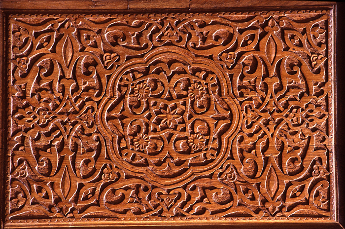
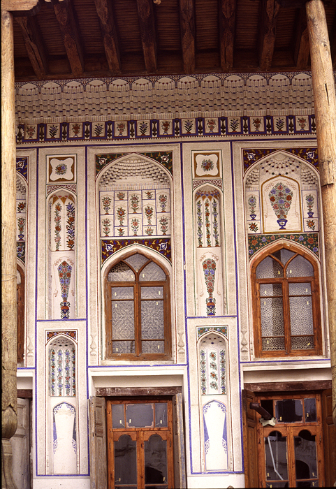
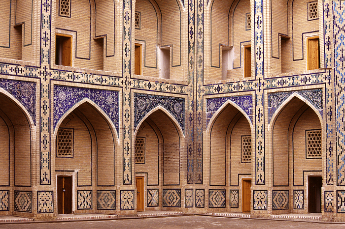
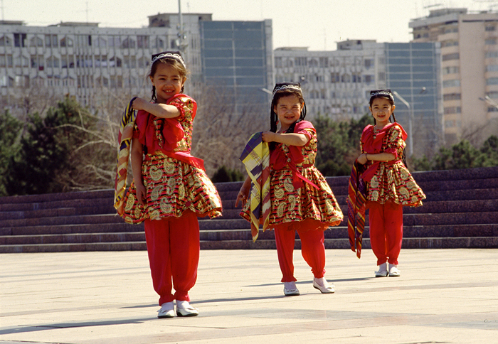
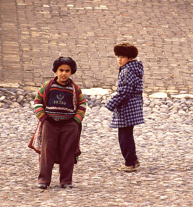
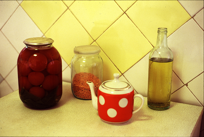
Some Photos From 1995 Trip to Uzbekistan

These images are scans of old slides taken during a 6 week trip to
Uzbekistan in 1995. I have stacks more sitting with all my other old slides
waiting to be cleaned, sorted and scanned. Maybe I’ll finally get to that
project this winter?

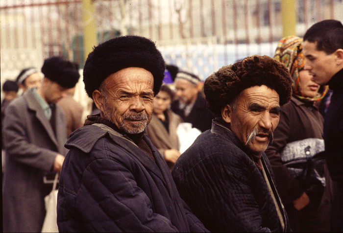
The image of the two older fellows was taken in the market in Osh, Kyrgystan
on a day trip from Andijan in the Fergana Valley. That market was one of
the two places on this planet where I most felt like I’d stepped back in
time. Even there, if I looked up to the surrounding hills I could see
Soviet style apartment blocks.

My other time warp experience was in Fez’s traditional Market the following
year. I’ll post some of those shots eventually too.

Bukhara_door_panelBukhara_house_museumBukhara_madrassaDancing_girls_rehearsalLads_at_entrance_to_buhkara_foSoviet_still_lifeTwo_men_in_osh_marketZoroastrian_temple_near_bukhar